info@abravenew.com
 (206) 746-5024
 2400 NW 80th St, #540, Seattle, WA 98117
CASE STUDY
apree health logo design
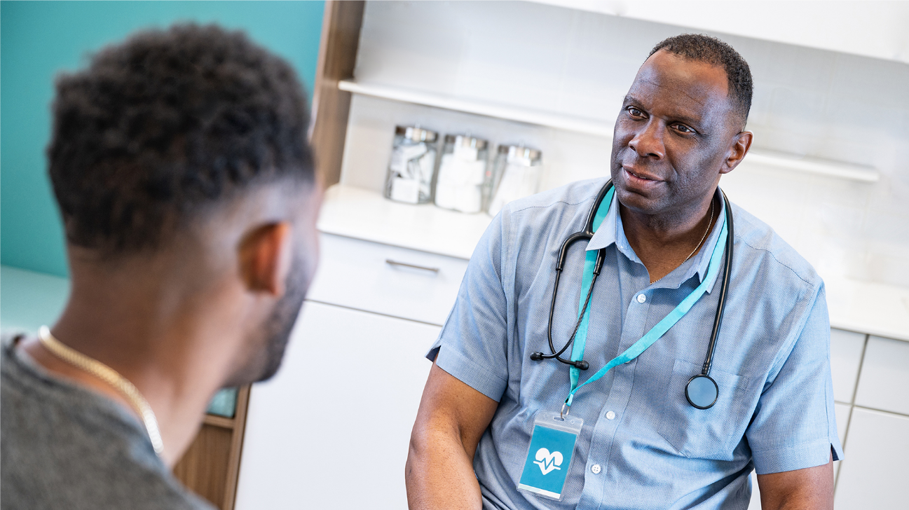
When Vera Whole Health and Castlight Health combined to create new healthcare brand apree health, they needed a logo that reflected their shared vision.

THE SITUATION
A new company steps forward with a big vision for healthcare, they needed a brand identity to match
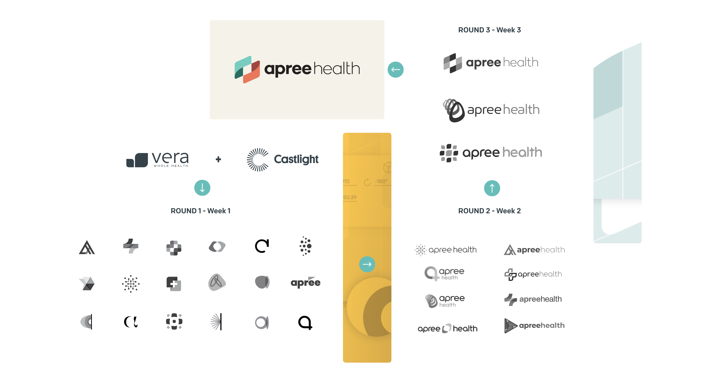
apree health is the result of Vera Whole Health and Castlight Health joining forces. Their goal was to combine their individual strengths, unlocking meaningful health outcomes, while making it simple and cost-effective for people to access, practice, and pay for healthcare.
When apree health initially formed, the new company was looking for a logo that emphasized humanity and technology. They wanted a brand identity that communicated their commitment to whole person care, evoking movement, outcomes, change, and emotive strength. And, they needed it quickly.
THE SOLVE
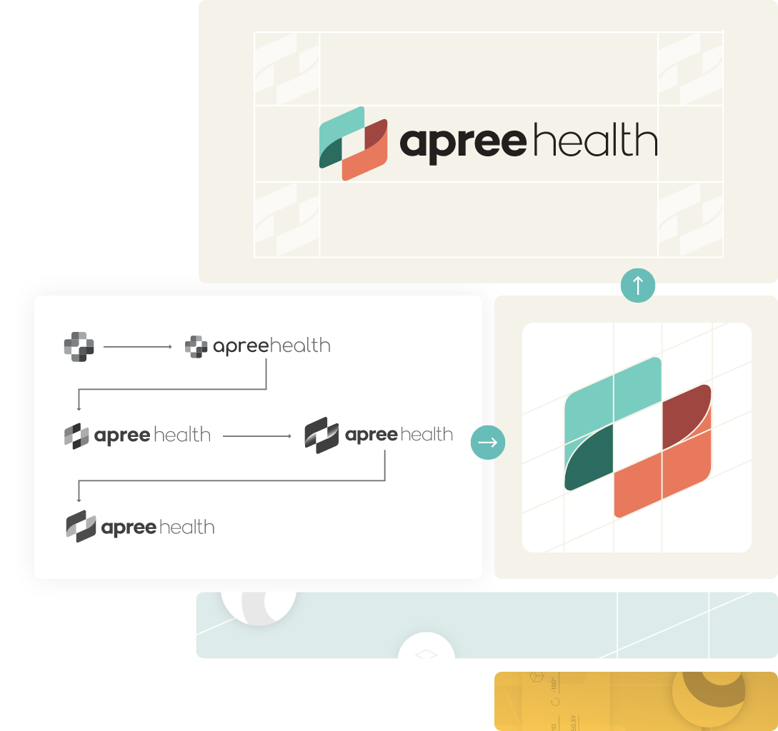
A breakthrough logo that stands out
The window for the creation of the apree health logo was short. Development also needed to occur in close collaboration with the apree internal design team, and the logo required final approval from the board.
The first round occurred on July 20th and the logo was approved on September 7th. The final logo meets all requirements, representing expansion, warmth, improved outcomes, and more. It’s also bold and impactful, complementing apree health’s bold plans to transform the healthcare industry. One month later, ABN also launched a one-page microsite representing the apree health brand and featuring the new logo.
TESTIMONIAL
Dynamic iteration and ideation is a the core of any logo design process...especially if there is a quick timeline. The apree health and A Brave New teams were able to lean in and collaborate quickly through working sessions to make this project a success!

Josh Dougherty
A Brave New, CEO