info@abravenew.com
 (206) 746-5024
 2400 NW 80th St, #540, Seattle, WA 98117

So you're creating a homepage. Or maybe you're updating or refreshing one. How do you make it "good?" Or—dare I say it—"great?" A great user experience (UX) requires a lot more than just great layout; it requires a thoughtful combination of things.
Let's take a look at some foundational UX, design (yes, they're different), and content pillars to focus on as you go through the homepage creation process.
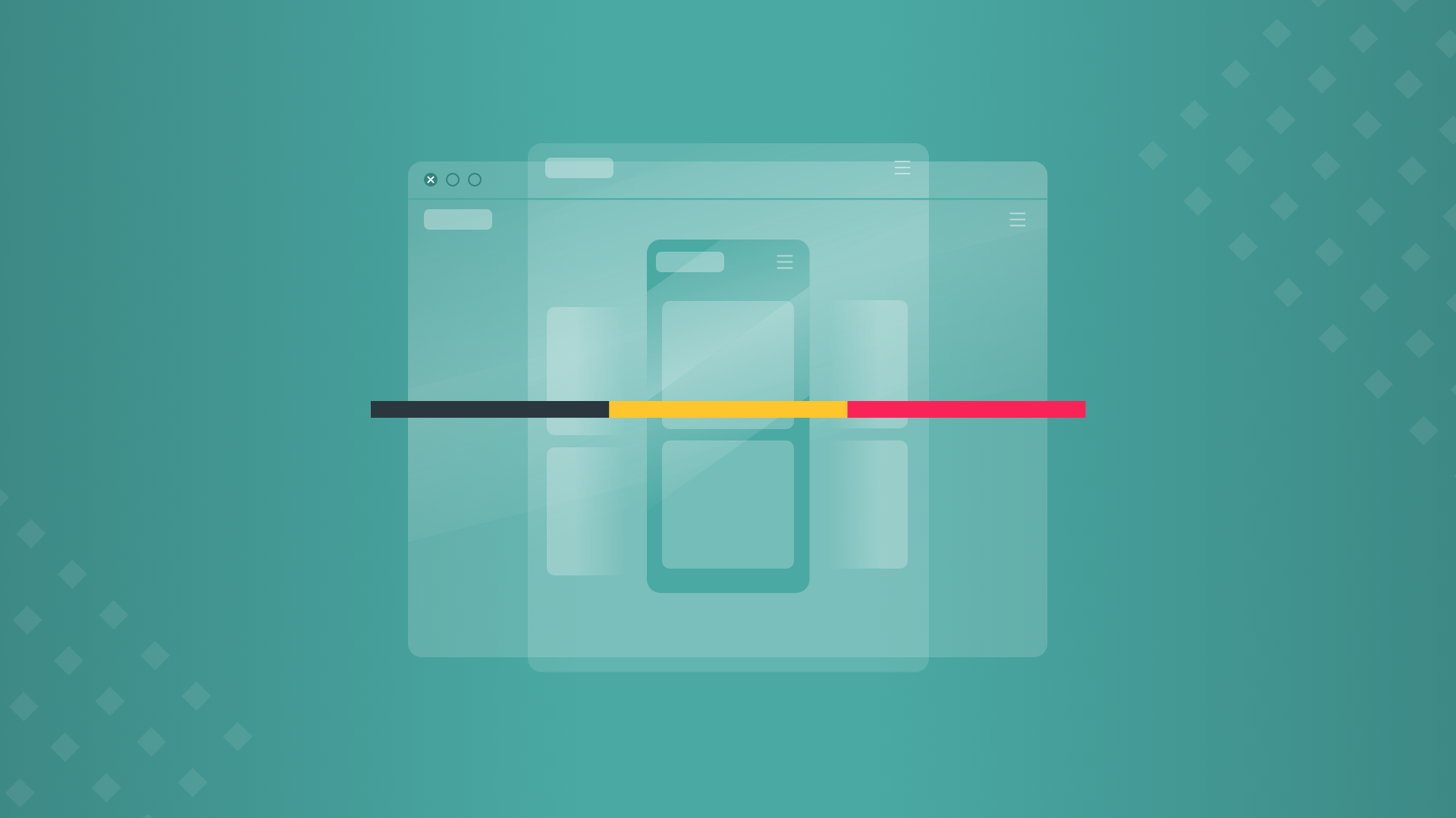
1. Make it glanceable
"What does glanceable mean?" you ask. According to the Oxford online dictionary: "glance·a·ble - denoting or relating to information, especially as displayed on an electronic screen, that can be read or understood very quickly and easily."
This pillar goes first because, well, we think it's the most important.
Creating glanceability involves making a lot of thoughtful decisions. Consider succinctness of the content, "pop"-iness of the design, punchiness/technicality of the tone, etc. Of all the pages in your site, the homepage requires the most obvious and easy-to-consume design and content. It's the area of your site where people should have to put in the least work.
With a glance or scroll of the entirety of your homepage, your audience should be able to:
- figure out what services, products, and information you're offering;
- quickly understand how to learn more about any given bit of information—usually through thoughtful design of buttons, hyperlinks, and other interactive elements; and
- get a good feel for your brand, including its style, energy, and voice.
2. Make it audience-centric
It doesn't matter how much YOU like the content and design of the homepage. Or your entire site, for that matter. That's just a nice-to-have. Your homepage and everything on it should be designed with your audience in mind. Content needs to be relevant to what your audience cares about. The design needs to be catered to their tastes and likes.
Even if your site has maximum glanceability, irrelevant content and/or a design style that misses the mark can quickly turn off your viewer. If you've already put in the work to establish a solid brand—including visual identity, messaging, tone & voice—you may have this covered. If not, do a little research into the tastes of your target audience, and make sure you plan out or audit your content and design.

3. Make it provocative
Leave people wanting more. Write content and create a design that tees-up your other pages.
Also... Keep. Things. Concise.
There's a lot of overlap with glanceability, here. Remember, this just goes for the homepage. Leave your detailed "Products" and "About us" info on your "Products" and "About us" pages.... If people care about what they see on the homepage, they're going to click that elegantly capitalized "READ MORE" button.
Your homepage should point people in the right direction, not spell out your whole site all at once and create a ton of redundancy. You want your audience to click around so that you can actually get an idea (from site analytics) of what matters, what works, and what doesn't. The deeper they dive, and the more time they invest in your site, the more inclined they'll be to take action.

4. Make it actionable
Speaking of taking action (see the last sentence of pillar #3)... none of the above does any good if you don't provide users with an easy and obvious way to take action. Don't make the mistake of providing your audience with fantastic, speaks-for-itself homepage content, only to leave them dangling without a way to learn more/take the next step.
Buttons, calls-to-action (CTAs), and forms are obviously the standard "next step" web elements. However, all those elements should be thoughtfully designed and placed. Don't get too aggressive (with visuals, or frequency) with CTAs, but don't be too shy, either.
5. Make it consistent
Use a consistent visual and messaging theme or style. This should all preferably be based on your existing brand (if it's in a good place). Avoid jarring visual transitions between sections of content. Make sure voice, tense, and tone follow consistent patterns. Try as hard as possible to make the homepage reflect your existing brand and other marketing assets (or vice versa). We're going for brand establishment, equity, and recognition here. Consistency in visuals and content will make it easy for your audience to absorb your homepage, as well as the rest of the site.
If you practice the guidance outlined in the five pillars above, you'll start your homepage out on the right foot. And, as always, let us know if you need a hand (or just another couple of heads to bounce around some ideas).
Don’t miss out, get Brave News now
Join the ABN community and be the first to learn about trends in inbound marketing, branding, and web design.