


 info@abravenew.com
 (206) 746-5024
 2400 NW 80th St, #540, Seattle, WA 98117


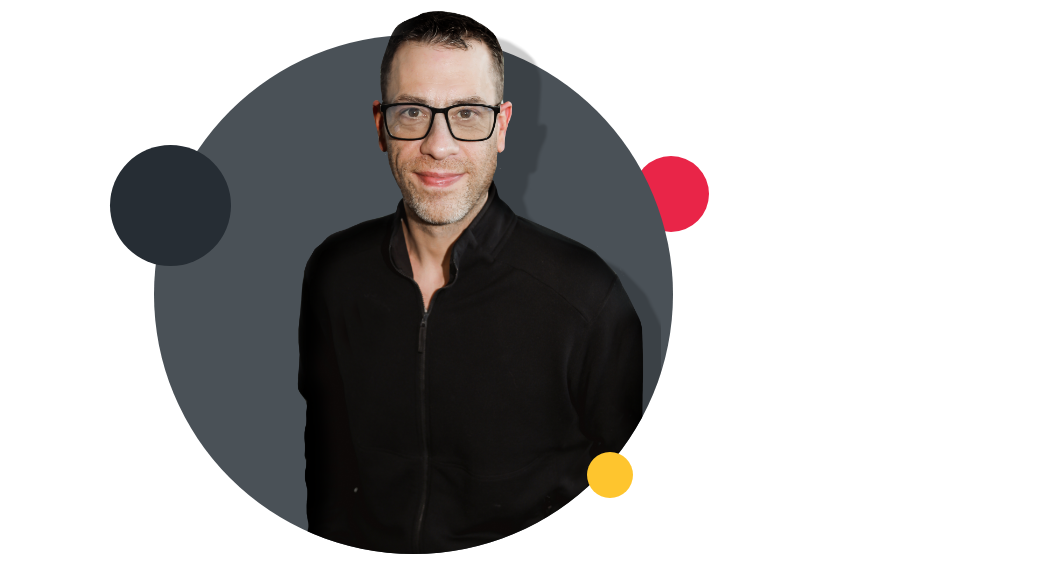
A Brave New’s Art Director Phil Padilla brings with him over 15 years of experience, including 12 years of freelancing for some of the top Seattle creative agencies including Touch Worldwide and Hey, Advertising. Through this he has partnered with brands like Starbucks, Microsoft, and Philips to build expert branding and product development. His work has been recognized twice by the M Award for custom product packaging. Phil is a content creator consistently recognized by partners as being a story-builder, embracing change with enthusiasm, owning major project deliverables from beginning to end, and achieving positive business results.
What you’ll learn about in this episode:
- How to approach building a comprehensive visual system for your brand
- Techniques for expanding the boundaries of an established brand while honoring the existing brand
- How to works with stakeholders through the change management process
- Which parts of your visual system you should be more careful about changing
- Ways to incorporate your overall brand strategy into your visuals
- How to build your brand visuals in a modular way that will make building out brand assets easier and more efficient
- How to evolve your brand after launch without losing the cohesiveness of the visual system
- What Phil and Josh are most excited about the new visual brand displayed launched on the A Brave New website
Additional Resources
Transcript
Josh Dougherty
Welcome to a brand new podcast. This is a show about branding and marketing. But more than that, it's an exploration of what it takes to create brands that will be remembered and how marketing can be a catalyst for those brands’ success. I'm Josh Dougherty, your host, let's dive in. Well, hello, everyone, and welcome to the show today. I'm really excited to be joined by A Brave New’s art director, Phil Padilla, today. Hey, Phil, how's it going?
Phil Padilla
Hey, Josh, thanks for having me on today.
Josh Dougherty
Yeah, of course, I'm excited about this conversation because just a couple of weeks ago, we launched a new A Brave New website, that is, a new website for our agency, A Brave New. And with that, we launched a really refreshed visual system, I think, a complete pretty comprehensive rethinking of how we show up in the world from a visual identity perspective. And so I really wanted to bring Phil on today to talk about that. And more importantly, really talk about how to refresh a visual system overall, right? Because this is like a kind of object lesson in us practicing what we preach. We laugh a lot. As an agency, t you often don't do the due diligence—that you do for your clients—for yourself. And so, we have done that. And I think it's a good example, to kind of walk through, talk about, ins and outs of that process, and maybe give you some insights on how you can do that for your own brand, if you're looking to refresh your visuals as an organization.
So, Phil, I'd love to start off just by hearing a little bit about, you know, what you like, what you like about these projects. We're going to talk a bunch about specifics of how we bring the strategy into the design, what the process looks like, how we build something like this out. But tell me a little bit about what you like about these projects, why do you enjoy them so much?
Phil Padilla
I love these projects simply because they have that macro lens, you know, you're able to really take a step back. And, you understand where your brand is today, the existing brand versus the industry in the market and really take a step back and use it as an opportunity to research it and push it forward into today's world. And there are certain areas that really, really hold my interest because there are levels to it. And the further you go on the journey, you start seeing the compounded efforts really take hold. You know, when you have a really robust compound library, you start noticing that the modules take shape and form much faster. And the rapid aspects of it really start to take hold at that point.
Josh Dougherty
Thanks. Yeah, I love that part too. As you start seeing all the different pieces that can fit together. As we dive in here, I'd love to hear a little bit. So, we are talking specifically right now about brands that maybe are established or have an existing brand. Not like a start up brand, but someone that's been in the market for a while, they have some brand awareness, etc. And we're looking at, okay, maybe the way that we're presenting visually into the world, the way we're expressing our brand, visually is a little bit dated, needs some updating? What's your process, Phil, at a startup, a project like that, to kind of get your bearings, explore and discover what's possible. How do you like to get started?
Phil Padilla
I think the biggest thing is familiarizing yourself with the brand, the existing structure, what points of success they had to lead them to where they are today. And really a broader understanding of not only the business, but also the market they're in. And that starts leading into the other areas of research that I really like to visit and have a very clear understanding of before we start moving into the creative solutions.And that's the industry and market as a whole—current solutions that align with desired functions and features of a current digital brand of today's world. So, the research and really taking that time to absorb information and really ultimately learn, familiarize yourself with the business, to me, is the most crucial first step. It helps you really get to a place where you can make more informed decisions.
Josh Dougherty
Yeah, I think about some of those experiences we had together. It might have been like nine months ago at this point, or even a year ago, as we started looking at different agencies’ websites and thinking about, hey, we love this portion of the brand. We don't like this portion. Here's how these different people are showing up, how does that translate into an A Brave New context? It's a pretty fun experience to free yourself to imagine what's possible because, typically, we don't get to do that. Right? Typically, we're working within constraints.
Phil Padilla
Absolutely, absolutely.
Josh Dougherty
Well, how do you explore pushing the boundaries of what's possible with stakeholders, right? A lot of people, myself included, I started this company nine years ago. I was attached to some of the visuals even though they were dated. They were something I was familiar with and fond of. And so it's your job as someone who's leading the design vision for the brand to kind of push those boundaries with stakeholders. So talk to me a little bit about what's your approach to doing that? How do you like to bring people along so they can think bigger for themselves than they could have before they started the process?
Phil Padilla
Sure, you can see the smile on my face because you learn over the years. This is often something you run into. The business owners spent a lot of time and effort establishing their company, and there's a lot of pride. And there's a lot of, you know, they view it as their baby. And so you quickly learn over the years where our line of safety is and where it really challenged them and pushed them for opportunities for growth. I mean, start kind of learning the curves of the highway, so to speak, and where the guardrails are, you know, little things such as logos and colors might not be the area to really, really push the envelope. But there are certain areas where it's my job to really step up and challenge the business owner. And really, it might make things feel a bit uncomfortable for the moment. But that's where we really start to see real growth because, the answer, the right solution, is typically in the midway point between really pushing the growth of the brand and honoring what happened to get them where they are today.
Josh Dougherty
Yeah. So you mentioned maybe you wouldn't attack logo, colors, fonts straight on? What are those areas that you would push? Where would you maybe try some new stuff on for size if you wanted to expand the visual vocabulary of the organization?
Phil Padilla
That's a good question. And I think I really hone in to, you know, I think we're all naturally storytellers. And we really want to elevate content and elevate our messaging. And so I really aim to increase the at-a-glance visual approach to things where they can still order, the user can still have the same quality of takeaways at a glance from a visual. And we can start layering in the tutorial aspects of things, because we're really here to educate, we're really here to teach, we're really here to take our clients along on the journey that we're on. And so, if we can capture those same qualities and those same takeaways and value points within the visuals, that's a huge leap forward, in my opinion. So I really will always push for improving the storytelling aspects of the visuals. And especially if that aligns with sales goals and other areas that really enhance the content and deliver a stronger story.
Josh Dougherty
Yeah. So in our brand, specifically, you did recommend some changes to fonts. And we did like an evolution of the logo, right? I think it's still recognizable as the same brand. But what drove you to make that decision to push on some of those more foundational elements of the visual system and not just on the tangential pieces?
Phil Padilla
You know, I think that to each their own, there's a bit of unique qualities, these brands. And, just because the guardrails are there doesn't mean it should be overlooked or ignored. That's why I think there are certain things that helped develop a brand for today's digital world. And some of those boil down to a lot of the core basics. You know, the common shape of a logo, for instance, does it work in a desktop or a mobile environment? A horizontal logo, for instance, that might take on the shape of like a landscape photo, will work really, really well on a desktop environment but would also open the doors to challenges in a reduced presentation, such as mobile or any of the smaller use cases that we have to consider today. And also, the same case goes for fonts. A lot of the really well-designed classics, serif fonts, that have a lot of high qualities and are really well used for decades in media. They're not as strong of a tool in today's digital world because of mobile and smart devices. So we're really honing in on some of the core aspects of the components. Does the typography read well at small sizes, does it translate well at big sizes? Is there enough weights to really effectively tell a story, from mobile all the way to desktop, and really control the readers eyes and the hierarchy of content? So I really look at the function, I really look at, does the functionality of the tools align with today's goals and a heavy use of the digital environment? And from there, I I make suggestions based on functionality. And today's best practices versus I like this color more than that color. I think preferences are great. The functionality is what really pushes us forward at the end of the day.
Josh Dougherty
Totally, I think I'm glad you brought up the fonts because we had a pretty, I mean, we had a strong serif font that was our body copy that we were using before we updated. We've now moved on to a set of sans serif fonts, it gives us more flexibility. And that was really hard for me from originally starting out as a marketer who worked in direct mail where you have your old school copywriters who are pounding into your head day after day: serif, serif, serif. But I think it's so true the point of, does the thing read well at a small screen size on mobile and still give us flexibility? Doesn't matter if it works well in print, you've gotta have it work well in all the formats that people are gonna engage with it now.
Phil Padilla
You as a designer, you changed with the times. A decade ago, and when print dominated our industry, serif fonts did us well. And now that we are in such a digital world with such small devices, being such a heavy integral part of it, you just shift with the times to really make sure that we're delivering.
Josh Dougherty
Totally. So let's dive into some specifics on our brand. You talked about how you'd like to push the boundaries, what are some of the things from the legacy A Brave New brand that you wanted to hold on to as you were trying to reimagine what things would look like? And then where are you maybe trying to evolve a little bit more so that we could modernize and update the brand for maybe the next, you know, 5 to 10 years?
Phil Padilla
My first download of the A Brave New brand, I was met with a very bold, visual approach to it. I thought it was very, very strong. And that was immediately followed with high-value content, I mean, high-value content, like real content that teaches and educates the user and allows them the opportunity to really improve and try new things and pursue the growth for their business on their own. So really, it has that layer of expertise to it that I thought was incredibly strong at high value. And I mean, if anything, I wanted to find a way of shining a brighter light on it to really bring it to the surface. And also giving it an opportunity to keep telling that story. I think refreshing some aspects of it can invigorate some life and really kind of bring to the surface some of that charm that was once there.
Josh Dougherty
Yeah. What about the stuff you wanted to move away from? Like, what were the pieces that you said, Hey, this may have worked a while ago, but we've got to switch. The sans serif or the serif font was obviously one of them that we made the decision to change but were there other things you wanted to adjust?
Phil Padilla
Yeah, I think the font was a big one, you know, the sans serif font. I think it was a very strong tool, once upon a time, but I think today's digital world really informed us that was, you know, we've run into a time where we really needed to make more of an informed decision of going forward.
Another area that I felt needed to change was when you change the font, and you have a type-based logo. You need to take the opportunity to refine the logo a little bit to not only reflect the new type style that we've adopted, but to also just kind of bring in that alignment layer, really have the opportunity to tell that story at the beginning. That's going to follow through all the way into the deeper layers of our content. And I'm glad you brought that up because one thing I did tweak slightly on our logo was the orientation of it—it was slightly skewed. And it opened the door to some challenges on smaller devices. So we did simplify the logo to more of a cleaner angle to really utilize some of our responsive state a little better. Another area that I felt like we had room for improvement was with our imagery. You know I'm a huge fan of telling our story in the best way possible and really visualizing the content and trying to provide visual takeaways that align with the content. And so I really wanted to also improve our imagery, and maybe use this as an opportunity to lean away from some of our retro style imagery that we had in our past brand and start, I don't know, walking away from that a little bit.
Josh Dougherty
Yeah, I think you did a nice job of honoring the bold colors as, like you still see those I think bold colors that were in our palette throughout the site, maybe in a more controlled way.
Phil Padilla
Right.
Josh Dougherty
But they create that connection point with the past, even though the front and center of its imagery is almost completely shifted, right? It's a job well done. I'd love to zero in a little bit on our brand. Now, you know, our brand is focused on creating unique memories at the center of a brand and building brands that are built on these unique memorable concepts. How did you try to infuse that idea into the visuals throughout the site? How did you say, Let's build a connection between the brand strategy or the brand essence and the visuals?
Phil Padilla
Well, I think that's a very good question. I think there are a lot of layers to that. I think the main way I really tried to approach that was improving the visuals to better tell our story and to really uplift our content. I felt like we had high-value content and a very compressed, surreal approach to things. And I think better telling our story in a visual manner was the first approach. Also, wanting to kind of fine tune some of our internal channels, so to speak, and use it as an opportunity to mount a little empower content, but also empower some of our partners. And so I refer to our blogs, our resources, and our podcasts, for instance. Those are three areas of our website that we've put a lot of time and effort into. And I really wanted to boost those portions and really empower the content. And our partners that we have on, for instance, where we're showcasing a lot of our podcast partners now in a more featured way. I think it really uplifts the content in a more premium to more premium level, and it really increases the presentation as well. So that's one way that we're really trying to strengthen the channels and really empower the content to keep rocking the boat for us.
Josh Dougherty
Yeah, for sure. Are you okay, shifting into talking a little bit about your process and how you build out a visual system? Ready to dive in there?
Phil Padilla
Yeah, let's do it.
Josh Dougherty
So, can you just explain for people what’s your general approach is as you're thinking comprehensively? You talked about that bird's eye view or being able to operate from a systems level. Like what's the overall approach to building out a comprehensive system of visuals?
Phil Padilla
Overall approach? First and foremost is research. You have to be familiar with competition, you have to be familiar with the industry, you have to be familiar with the market. And you have to be familiar with the steps that businesses have taken to get to where they are today. At that point, when you feel like you are familiar and you have a solid knowledge base that you can build on, and that you're almost an integral portion of that business, you've had a lot of informational sessions with the team, you've had a lot of competitive analysis hat you've looked at, a lot of data to support that. That is the first and most comprehensive portion to really build that core foundation to really start making more informed decisions when you get into trial and error of creative solutions and really start to shape the creative approach to solving some of our goals.
Josh Dougherty
Sweet, and then what are some of the facets of the work that people often miss? Like, dive into details people may deal with, I mean, I've seen so many style guides, right where you just have color do's and don'ts for your logo, a couple of font things, and then the rest is the Wild West. Now, most people are more detailed than that and they're thinking through some imagery, they're thinking through some textures, etc. But what are some facets that you believe are very important for having a comprehensive brand that folks might miss in their process?
Phil Padilla
One of the areas that I feel like folks can spend a little more time on is market research. Competitive analysis is more than just knowing that they exist. You have to dive deeper into understanding how they handle certain scenarios, how they're handling messaging with their user base. What sort of value proposition are they differentiating themselves with? So I think that's one area, but another area that I hold close to my heart and that is after you have a very, very solid understanding and you've done your research—it's taking the time to really flesh out a component library that dives deeper into the nooks and crannies of a brand and some of those core basics that you mentioned, you know, the colors, the fonts, the logo, the textures. It really gets into a lot of the higher level aspects that really bring the site to life and that user experience to life. And, what I like to do is I like to start with a material UI base. And that really, really allows us to kind of break into a lot of the navigational aspects, you know, what is a form gonna look like? How are we going to handle these scenarios throughout the website in a consistent way? It really gets the water boiling, so to speak, where you leave stones unturned or, excuse me, you don't leave stones unturned, and you really explore the nooks and crannies. And you use that shaping of the component library to an almost a micro design process where you have cycles of feedback with the clients and work through the iconography. And you work through all the deeper layers of the brand, you know, not only the colors, but where the colors are used and why they're used. So, the purpose behind the tools and you really kind of get them through the tall grass and the details.
Josh Dougherty
Yeah.
Phil Padilla
If you spend a lot of time fleshing that out and getting the ducks in a row and really aligning yourself with all of the core team members, it makes the following steps of a project move at a much more rapid pace. And so, to me, if you do that portion well, it creates a nice creative process with very little unpredictable areas.
Josh Dougherty
Yeah. And it allows you to get to this, I think you use a really modular approach to the brands that you're building out. So you talk about all the pieces of the building blocks that fit together. How does this approach really help you with building out assets, etc? Like, what does it look like as you move beyond ideation into execution?
Phil Padilla
Good question. So when you transition from the component library and the modules, I like to start with page tables and wireframes to really nail down content flow. At this point, we're working with the content team very heavily because they've already put a lot of time and consideration into messaging, into content flow, and how we ultimately want to present our content. But really, it also boils down into a very modular base system. As you mentioned, these are the Lego pieces that really kind of build out the entire system. And there's a lot of overlap and consistency, so to speak.
So we approach it in a modular way, that not only gives us the opportunity to refine things in an isolated environment, per module. But it also allows us to repurpose modules in a very fast way. That allows us to build pages in a very fast way, because we have all these Lego pieces ready to go. And from there, there's a lot of flexibility. So you know, you can not only repurpose, where you can restructure, you can also reorganize and you can introduce new custom modules. And when you combine all those pieces, you can really start to shape and form custom components to a website that you didn’t need yesterday but you’ll definitely need tomorrow, such as landing pages, new specials, or value propositions you want to release out in the wild. And this really delivers that core flexibility to build and bring things to the world that didn't exist yesterday.
Josh Dougherty
Yeah, for sure. And I think another area I'd love to have you talk about a little bit is when you have a brand that exists in a physical space or in some physical manifestations, how do you ensure that the system that you're making extends beyond just the website, which is definitely something we're largely focusing on, right? Because it's the front door brand experience for most people. But how do you make sure it extends into those physical spaces really well and that we're not just thinking so digitally minded that it's hard to translate that?
Phil Padilla
That's a very good question. And I actually take a lot of pride in this. I think this is one area where a lot of agencies get this wrong, and I think it's a hard thing to get right. How do you have a very nice website that fits today's digital experience expectations? And then you have these resources and PDFs they download, and they feel like classic print files from, I don't know, 20 years ago, and there's that disconnect. To me it should almost be, I kind of reverse engineer it. To an extent, like you take resources and guides, for instance, where users already had the opportunity to browse the website, read through the content, decide that there are some resources or guides that interest them, and go through the steps to download them. And at that point in time, they're already familiar with the brand, they're already familiar with the presentation. So, in my eyes, that the downloaded resource at that time, the PDF should reflect the website, not the opposite. So, I almost worked backwards to where we have, we would have approached it 10 years ago, where these PDFs and these physical pieces, whether it's a large banner or an event floor or a PDF that someone might print and take with them on the go, they should ultimately reflect the website and ultimately reflect a digital landscape. So certain characteristics are used on the website that you carry through and really kind of hone in on that consistency. When you see these physical pieces, there are no ifs, ands, or buts, there is instant alignment, instant recognition, instantly the story picks up right off.
Josh Dougherty
You feel the same? Even when you look at … I'm thinking, back up, like some of the other things that we've worked on through the years. Like, we did branding for Huntsman Cancer Institute, who has a big healthcare facility, right? So, some of the brand is extending obviously into the hospital. Do you think the same thing follows? There's obviously best practices for space design, and all those sorts of things that we're gonna follow, but as you expand the brand is that the same thing, letting kind of the website approach or style lead and then trying to reflect that down in the physical spaces? Or does it change when you're getting to something along those lines?
Phil Padilla
I think it changes naturally a little bit. I definitely wouldn't use the website as the place of truth. I've used the brand as simply as, um, so for instance, like wayfinding, in a healthcare environment, where there are a lot of small details and a big, excuse me, my words are escaping me at the moment. But you know, something like wayfinding, I would honor the key tools of the brand, such as typography, but I think that's one scenario where you don't necessarily need to have that instant recognition of the website because that might not be where the user originated from. But I think it's really key to have those consistent brand components such as type, color, even iconography, arrows, and subtle aspects that really help with the directional piece.
Josh Dougherty
Yep. Nice. So this is probably a gimme question. I will not ask it as a question. Because I wrote this out in our notes, right, as once the brand has been launched, do you think the system should stand still? I know, you're gonna say no, it needs to continue to evolve. So I'd love to hear more. Like if you could dig into how you ensure that as that evolution happens, that needs to happen as you learn, here's a new application for the brand, or here's a new trend that's happening, and we're figuring out how to show up in this channel different in a way that says to the parent brand, but it's also true to the channel. How do you make sure your work stays true to the core brand, even as it's shifting and changing to show up differently in new places or new applications?
Phil Padilla
That's a good question. And, I'll backtrack a little bit, typically a little more at the tail end of a really large website. It's been a journey. And so we are, I don't know, we're a little too familiar with the work at that point where I guess it has less impact on us. And I'm not gonna say it's not good work, I just think that it's lost the charm a little bit.
And so, when we get to that core baseline where we just launched a new site, a new brand, we released a lot of new elements out into the world. Normally, by then, myself and other team members are a little exhausted by it and need a little bit of a break—an opportunity to kind of step away and reset our palate. We're often on other client projects or other tasks in that degree of separation, in my opinion, really. It allows that opportunity to kind of reset, and not only you get to the baseline where you release a lot of elements out into the world, but then you take a moment to gain that degree of separation, where you can approach it with more of a risk of refinement perspective moving forward.
And then you start wanting to see features and functionalities you want to improve. You start already seeing certain areas that you wish you had another swing at the ball, for instance. But I also think there are a lot of areas that open the door to new obstacles. And it's important. I like to work through with the business leaders and strategists to really kind of talk through some of these components, because I find when you get that interactive aspect to it, you're able to quickly work through a lot of the problems. Just because I think something might work, the rest of the team might disagree. So it really kind of opened that door to challenge ourselves to push ourselves a little bit and start kind of layering in those refinement features. Other goals, there are other pieces we want to do, that we all want to push forward. When we get to where we want to be today. Where are we going tomorrow?
Josh Dougherty
Yep, absolutely. Let's close this thing out by talking about your maybe in that first degree of separation phase with the new ABM brand because you've just spent a lot of time focusing on it. But what do you think is the thing you're most excited to show the world about this brand?
Phil Padilla
I don't know, there are a lot of pieces in there that are really exciting. I think that we've taken a lot of time putting a lot of effort into the visuals to not only enhance the content, but to also really provide those key visual takeaways that are provided throughout the content where users want to skim the content for reading or learning. So I think that's one area that I think we should be particularly proud of. The visuals, in my opinion, are now aligned with the content, the content was always high value and had a very tutorial element to it. And now I feel like the visuals are now at a place where they support it. And they continue to tell that story. And they have those takeaways at a glance that I think may have not been so prevalent previously.
Josh Dougherty
Totally. I agree with that. And I think if I was to call it a specific area, it is how we've both highlighted feature content on the homepage, whether it be case studies, blog posts, etc. To get people immersed into it, I think it is an interesting, interactive experience. And then, also, as we get into the case studies, just making them much more of a thing in the past. We had good content there, like you said, but it didn't really showcase all of the work. And I think the balance between the visuals and the content and the case studies is really upgraded. So I'm excited to see people's response to that as they dig into it.
Phil Padilla
Yeah, I'm very excited to get this out into the world. And, we want to see results. I think that once we get around to the world, we'll see the key areas where we need to focus on next.
Josh Dougherty
Yeah. That's the best part about launching something right? You get some actual data, their feedback from folks, so awesome. Well, Phil, thanks so much for joining me today to talk through this, sharing some of your expertise, which you certainly have a ton of from all your work over the years. But yeah, really glad to have the conversation.
Phil Padilla
Thanks, Josh.
Josh Dougherty
All right. Talk soon.
Thanks for listening to this episode of A Brave New podcast. Go to abravenew.com for more resources and advice on all things brand and marketing. If you enjoyed this episode, show us some love by subscribing, rating, and reviewing A Brave New podcast wherever you listen to your podcasts. Every new podcast is created by A Brave New, a branded marketing agency in Seattle, Washington. Our producer is Rob Gregerson of Legato Productions.

Similar Articles

OCT 11, 2021
The Beginner’s Guide to Generating Inbound Leads
Marketing doesn’t have to be painfully intrusive, like getting yet another telemarketing call right when you sit down to dinner with your family.
OCT 11, 2021
The Beginner’s Guide to Generating Inbound Leads
Marketing doesn’t have to be painfully intrusive, like getting yet another telemarketing call right when you sit down to dinner with your family.