info@abravenew.com
 (206) 746-5024
 2400 NW 80th St, #540, Seattle, WA 98117

Most of us are familiar with the surface layer of responsive design—it’s the ability to deliver consistent presentations across all devices and channels. One could easily start browsing recipes on their phone on the way home and pick up right where they left off on their desktop machine when they arrive, without missing a beat, same link, same presentation. This responsive feature offers a bit of regulation for today’s digital world which can become challenging to design for due to the wide variety of screen sizes and feature sets to factor in.
If the ability to view content fluidly across multiple screen sizes is the surface area of responsive design, then what fundamental benefits lie beneath, and what design approaches can we use to ensure our experiences are truly responsive? These are the questions I’ll seek to unpack in this post.
Where Responsive Design Originated
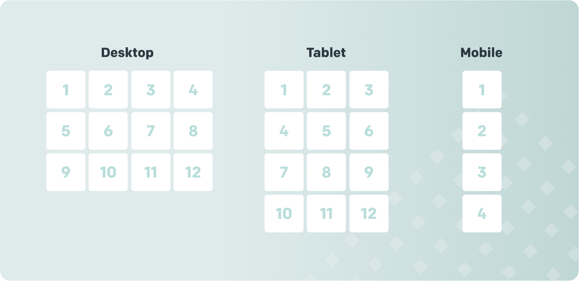
For many years, web pages were designed with fixed screen sizes in mind, desktop computers, and the job was easy. As tech evolved, screen sizes did as well, and once mobile and tablet came into pla, the environment became much more dynamic and needed a much more simplified solution. Shortly after, the term “Responsive Web Design” started to cycle. It started with Ethan Marcotte when he published a book with the very same title. By 2008, the methodology of responsive design evolved into fluid grids or inline blocks. Below are a few examples that showcase a presentation that covers desktop, tablet, and mobile views, and how it would respond to the varied page width in a fluid environment:
This view covers the presentation and content management aspects for a responsive web page, but it skips over the key benefits that heighten the user experience, create memorable moments, and shape today’s web trends.
Let’s dive a little deeper into the growing trends.
1. Heightening user experience through content access
This may sound obvious, but as a user, it can become frustrating to bookmark your mobile tasks until you are in front of a desktop computer. Access to content is a huge portion of responsive design and can also be a sticky point if a user is feeling device restricted. A good example would be the filtering feature often affiliated with blog or eComm content. Or the ability to search through site archives or to make large purchases with confidence.
Covering detailed information gets tricky in an environment that relies on simplicity. At ABN, we start by focusing on the basics and mapping out all of the web page goals through content architecture and low-fidelity design (wireframes). This is an important step to keeping a large team organized and aligned so the design team is able to remain focused and goal driven.
2. Search engine optimization (SEO) is highly valued
Responsive design directly influences SEO results. It has the ability to manage and reduce duplicate content for mobile while keeping load speed top of mind. For instance, Google recommends that all digital design systems follow best practice by utilizing html for all devices and only using CSS media queries to ensure content consistency from one device to the next.
At ABN, we understand the value of clean html and CSS. Our development team always aims to deliver the same line of code for all devices because we know the details make the difference in a well-crafted product. To ensure we are able to accomplish this goal, we loop the SEO and development team in early to review the low-fidelity designs and to recommend constructive feedback. This provides feedback cycles and team alignment that offer an opportunity to collaborate and to try something innovative.
3. Quality of components always wins over layout control
Design and layout are fluid. When done correctly, they will always vary in size and some portions will remain slightly out of your control. To compensate, we ensure the design components are of top quality and concern ourselves less with the general composition.
To ensure that we remain system-minded, we start all web projects by defining the brand design system and assembling the component library, our toolbox. This immediate first step allows us to take a closer look at the individual components, such as: color, iconography, typography, imagery, in a much more isolated environment. It also informs the page layout and works in alignment with the content and architecture team.
Simplicity
Utilizing minimal colors and whitespace within a design to capture simplicity is not enough. Simplicity is captured when a user is able to accomplish their goals with minimal effort, through UX design providing on-page clarity. To better achieve this step, we need to first understand the gap between the user’s goals and the means to achieve them. We can accomplish this by defining the user’s persona and ensuring their needs are met by mapping out the user journey with content architecture.
One advantage we like to lean into is starting with the mobile journey first, it constrains the design team to only utilize goal-oriented components from the beginning. This approach opens the door for the game of addition: mobile > desktop, versus a game of reduction: desktop > mobile.
A User-First Approach: Mobile
You can now view websites on your watch. Talk about responsive design at a micro level. However, mobile remains the dominant device for information and entertainment seekers alike. But, let’s take it one step further by declaring our independence from devices and focusing on what really matters in design: users.
By gaining a user-first perspective, we are able to focus on the user’s needs at each phase of the journey and ensure that only the necessary features/content are present when needed. Every step of the way, our design team must ask: Is this component really needed? Does it provide on-page clarity? If not, it won’t be needed.
Designing for the Surface Layer of Responsive Environments
Here are some design tips and tricks we like to utilize at ABN to favor the visual presentation of a responsive environment:
- Design systems: Take the time to get this right and be thorough, it needs to be bulletproof
- Define styles within the design system: Content comes in all shapes and sizes. To best prepare, we define typography waterfalls early within our system to avoid surprises at a later date. Prepare for both sides of the spectrum.
- Navigation/menu: This is an opportunity to heighten your user experience, provide navigational depth, and strengthen SEO. By utilizing a desktop full-screen menu (hamburger menu) it removes the complex navigation from on-screen presentation and keeps everything simple and within reach when needed. It also raises the bar on a memorable user experience.
- User-friendly typography: This boils down to readability at small sizes, capturing brand style, and being web-friendly for load speed and consistency.
- Solid communications throughout: Most things can be solved with effective communication. We like to get all teams involved early to help us anticipate any problem areas or perhaps a different route to accomplish our shared goal.
This comes down to asking the right questions and engaging early. Things get lost in communication, let’s work smart.
Our Goal Is to Create Predictable Environments on All Layers
Design systems built for responsive environments can become your best friend if you gain the right perspective: user first. Once that perspective is achieved, you will be free from all of the device constraints typically associated with web projects. Here’s a project our team finished earlier this year that we’re particularly proud of. It showcases a design system intended to be in the driver's seat of a responsive environment and has a user-first approach: Claim Simple
If you would like to learn more about working with A Brave New, drop us a line!
Don’t miss out, get Brave News now
Join the ABN community and be the first to learn about trends in inbound marketing, branding, and web design.